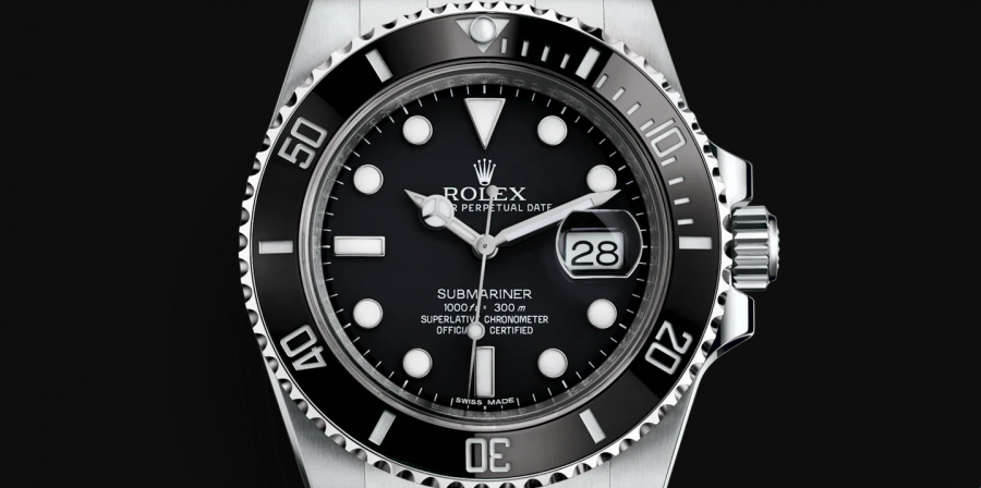
Rolex Submariner Ceramic Dial Variations
Many of Rolex’s models are manufactured for years and years under the same reference, with no real visible change. This is mostly true to Rolex’s modern watches, as many of Rolex’s vintage watches have received notable updates during the course of its production without changing the reference number. Take, for example, the Submariner 14060 which changed from tritium to Luminova, to Superluminova, to having an engraved rehaut, to having both two and four lines of text. That is a lot of changes to a watch that kept the same reference number…
But many of Rolex’s watches receive updates and changes so small that they are barely visible to the untrained individual. And certainly too small for Rolex to update the reference number.
As you probably know, Rolex as a company is very conservative. But at the same time, they consistently strive for nothing but perfection. This means that they are always looking for ways to improve their watches, no matter how minor they may be. Most of the time, they are minor so that for most people, they are not even noticeable. And for more noticeable updates and changes, they demand a completely new reference.
In this article, we will talk about Submariner ceramic dials, and highlight how Rolex, during the production of the Submariner 116610 and 114060 has made minor changes to the dials. And for most people, these changes have gone unnoticed, so we hope this article can be eye-opening for you, regardless of how small these changes are.
While these small dial variations of the ceramic Submarinersaren’tt something that people consider today, who knows, in the future, they may affect which ”generation” of Submariner ceramic is more collectible. This is what makes this topic a whole lot more interesting.
While the variations are not as big as many vintage watches such as feet first or meters first, it’s the small details that collectors look at. But what the future holds, we have to wait and see.
Because Rolex has not publicly mentioned these small variants in the dials, it makes things a lot more interesting, as we as collectors have to do our research among the production years, and try to circle in when in the production of these changes took place. With that in mind, please understand this resource is in no way meant to be a complete guide.
Rolex Submariner ceramic dial variations
The fist Rolex Submariner with maxi case and maxi dial was the Rolex Submariner 116619LB in 2008, followed by the 116618LN, 116618LB, 1166613LN 116613LB in 2009.
- 2010 saw the release of the most classic Submariner reference 116610LN.
- 114060: 2012
- 116610LN: 2010
- 116610LV: 2010
- 116613LB : 2009
- 116613LN: 2009
- 116618LB: 2009
- 116618LN : 2009
- 116619LB: 2008
Seeing that it has passed more than a decade since most of the Submariner watches were released, these watches have had a long production period, without any official changes to them. But obviously, Rolex has changed a lot in its manufacturing process during this decade, and as a result, this has lead to small differences between them, depending on when they were made. Let’s look at some of these differences, with a focus on the dials.
Obviously, these small dial variations will have different years as the year of manufacture does not necessarily have to be the same year they were sold. The fact that Rolex uses random serial numbers makes it impossible to say a clear-cut time period when each of these dial variations and changes were implemented.
So please note that the dial variations and the respective years of the Submariners below is not the case for all Submariners, and differences exist between Submariners that have the same year written on the warranty card. See this article more so as a highlight of the dial differences, although clear differences exist between the very early Submariner ceramic and 2019/2020 Submariner ceramic.
Rolex 116610LN Submariner ceramic dial variations/generations
Let’s start with the Submariner 116610LN – the most classic and iconic Submariner:
Rolex Submariner 116610LN 2010-The first year of manufacturing:
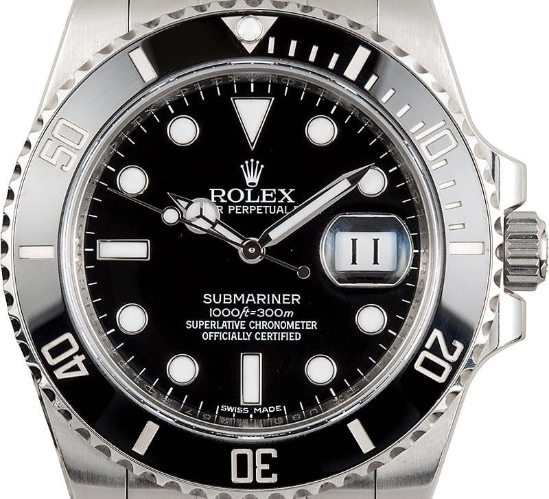
- ”SUBMARINER” printing is made with rather thin letters
- ”A” in “Submariner” is flat at the top.
- The depth rating has a leaning ”f”.
- The “ft” has little space from “=” and “300m”.
- The m is close to the 300 and slightly leaning forward. The ”=” is slightly leaning forward.
- The “m” in swiss made of the 2010 version is different from others. The”middle leg” in the “m” does not extend to the bottom.
Rolex Submariner 116610LN from 2012
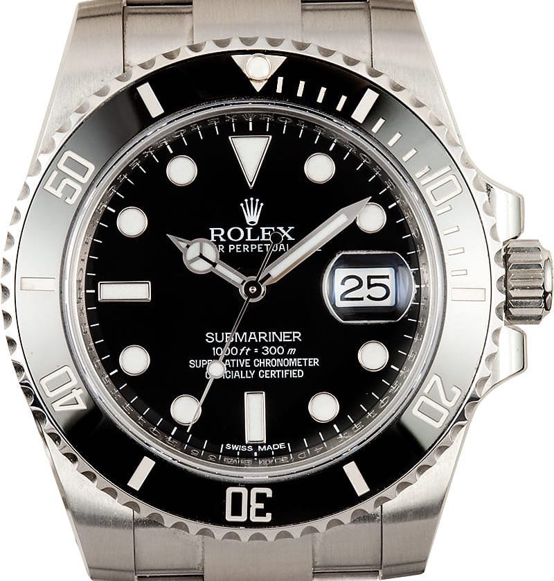
As you can see when comparing these two images, these two watches have small yet noticeable differences in dial printing.
- First off, the top of the ”f” in ft does not extend over the t as it did on the 2010 version
- Furthermore, the line across f does only point out on the right side, whereas on the 2010 pointed out on both sides. This is also true for the ”t”. The f is also smaller and does not extend as high or as low. You can also see that the zeros in ”1000” are more oval in this version, whereas on the 2010 version, the zeroes were circular.
- You will also be able to notice that the ”Swiss made” printing is not identical.
- On the first version, the ”S” in ”Swiss” is more compact, with the ends pointing straight. But on this dial, the ends point more up and down. The letters on ”OFFICIALLY CERTIFIED” are also different. For example, the ”C” and ”E” are different, with the latter version not having any edges, but rather straight lines.
- The biggest difference is perhaps the ”=” between ft and 300.
- As you can see, there is a big gap, as following ”100 ft = 300 m” as opposed to the previous 100ft=300m”.
- You will also notice that the = is completely straight and not leaning forward. Lastly, there is also a gap between ”300” and ”m”.
Rolex Submariner 116610LN from 2014
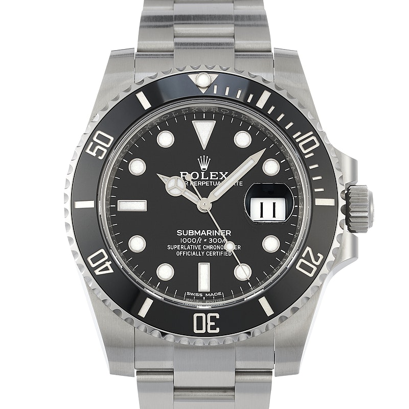
Here is a Rolex Submariner 116610LN from 2014.
- What is most interesting about this watch is that the dial has what has started to be known as ”Submariner” fat font by some people.
- The printing is much thicker than previous versions, and the font is also different. Compared to previous years, the ”SUBMARINER” text does not have any sharp or pointy edges. While it has kept its distance between ft and 300m, the ”f” is now raised and ends above the ”t”. It also extends longer than the zeros, similar to the first generation, however, the ft printing is not as sharp as the first Submariner ceramic dial variation.
- The = still has a distance from ft, but the ”m” in ”300m” has been moved closer to ”300”, so there is no longer a space there.
- Looking at the ”SWISS MADE” text, you can also see that this is more similar to the first Submariner, with the ”S” pointing straight forward rather than pointing up and down.
- It also appears that the Superlative chronometer officially certified printing has been made smaller, and the lettering is certainly not as pointy and sharp as before.
- “A” in Submariner is not flat at the top.
- “officially” stands at a slight Gap between the last L and the Y – “OFFICIALL Y”
Rolex Submariner 116610LN from 2016
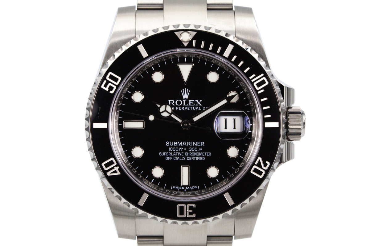
- Oval zeros in 1000.
- Line across f in ”ft” cuts across the letter.
- The end of t in ”ft” does not point up
- Space between ft and 300.
- Space between 300 and m.
- Submariner print not bold.
- Swiss made print similar to 2012 print with ”S” not looking almost like a reversed Z.
- Not previously seen font of ”ft”.
Rolex Submariner 114060 originally sold in 2017
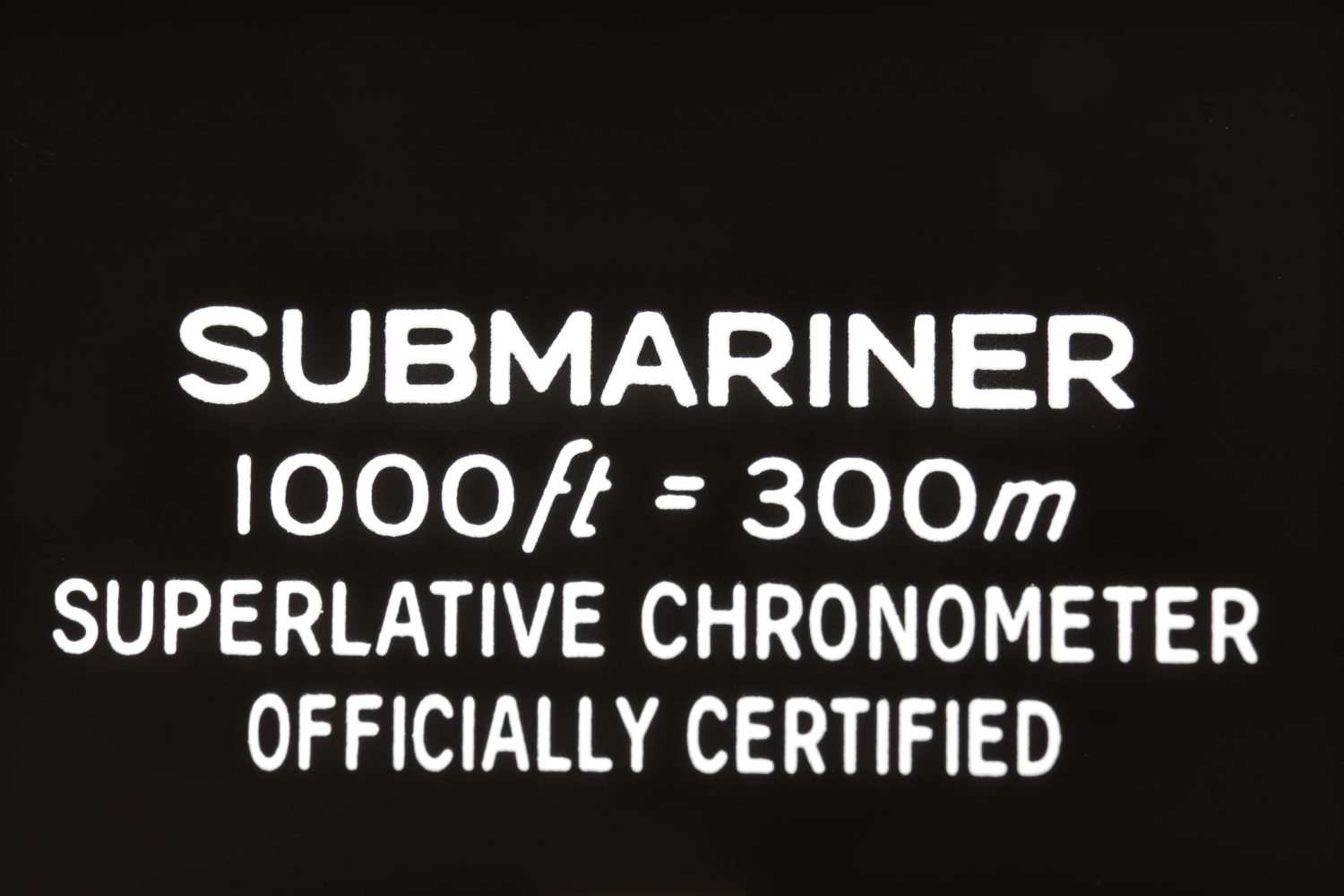
Rolex Submariner 116610LN dial variant 2018
We have noted that 2018 versions have both fat and thin printing, which is interesting. But this is most certainly the case for the other dial versions and years in this article as well. See the two images below of two 2018 Submariners as reference:
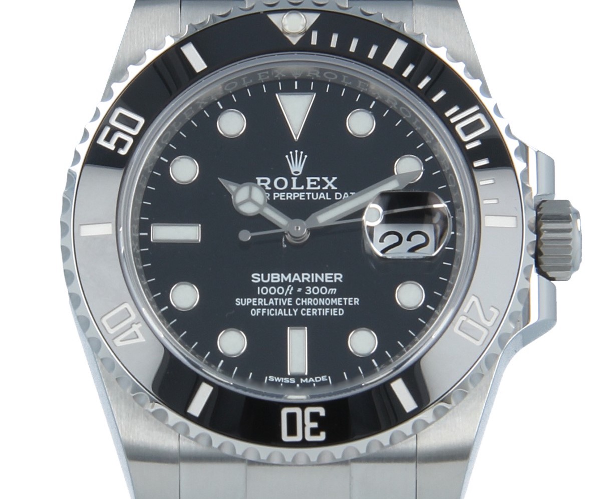
- Bold Submariner print
- Space between ft and “=”
- No space between 300 and M
- Flat S in Swiss made
- Bold printing on all other text
- Oval zeros
- The”middle leg” in the “m” from “ chronometer does not extend to the bottom.

As you can see, there is a distinct difference between these two.
- Round zeros.
- ft together.
- f extends over the “t”.
- No large gap between ft = 300.
- no large space between m and 300.
- The line does not cut through on both sides on f in ft.
- No bold Submariner print, but not as thin as certain previous versions.
- The ”D” in Date” starts after the X in ”Rolex”.
Rolex Submariner 116610LN from 2019 dial variation

- Oval zeros in ”1000”
- Spacing between ”ft”, ”=” and ”300”
- Spacing between ”300” and ”m”
- The line in ”f” in ”ft” points out on both sides.
- Submariner printing not as bold
- Swiss made printing different from the above image
- ft smaller
Most notable differences between the ceramic dial variants
As you can see from the examples above, there are some elements of the dials that have the biggest differences.
These include:
- SUBMARINER printing
- Spacing between m and 300
- The shape of the zeros
- ft font and style
- Spacing between =
- Swiss made printing
These differences also apply to the rest of the Submariner references other than the 116610LN.
Additional Rolex Submariner ceramic dial variations
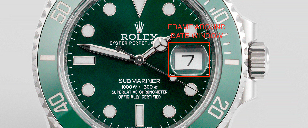
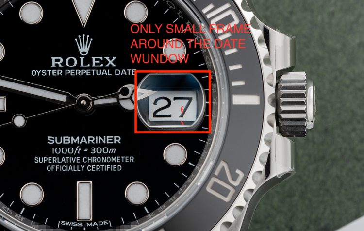
Another dial variation is the date window.
On some dial variations, the date window has a frame, whilst others don’t. See the reference images:
Reasons for the Rolex Submariner ceramic dial variations
Rolex has not gone official with any of these small dial variations. The changes are simply too small to demand a new reference number, and thus, Rolex continues its production. Having in mind that the Submariner ceramic has been in production for more than a decade, you can expect that things have changed in the way they make their watches. The most logical explanation of these differences has to do with the retooling of printing pads during production. However, as Rolex has made changes to the dials that are not affected by the printing pads, some of these variations are absolutely conscious changes. This includes, for example, the font of the print, the space between ft = 300m, the space between 300 and m. And more.
There are some theories that Rolex does this to combat counterfeiters, however, others argue that the more variety in the dial, the more difficult it would be to identify a fake Rolex Submariner.
What is most notable is that most official retailers are not aware of these variations, which, ultimately, can cause them to mistake a watch for being fake when that is not the case.


The “ROLEX” is different as well. Check out the “R” and the “L”. On the R, sometimes the leg is straight, and others there is a bit of a horn shape. The L finishes higher on some and lower on others. And those two details do not always match so there are at least three variations.
Good point! You’re absolutely right about that!
Kind regards,
Millenary Watches
Has anyone noticed the ceramic insert numbers ? Some are thicker than others ?
You are right!
Thanks for pointing it out!
Kind regards,
Millenarry Watches
Thanks very interesting blog!
you missed the 2011 which is differnt from 2010 and 2012. Strangely similar to 2016
Hi,
Thanks for pointing it out! It’s very difficult to pinpoint exactly since the date on the warranty card doesn’t necessarily reflect the date of manufacturing.
Kind regards,
Millenary Watches